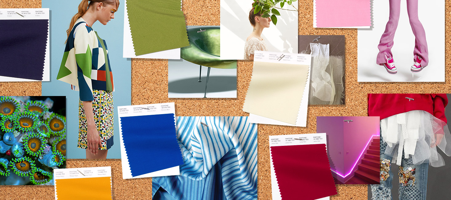
Pantone Colors for Spring and Summer 2019 Revealed!
Ready to see the colors of the seasons next year?

Each season the team at the Pantone Color Institute creates the Pantone Fashion Color Trend Report; a color overview highlighting the top colors fashion designers showing at New York Fashion Week will be featuring in their collections for the upcoming season. The Pantone Fashion Color Trend Report is your easily accessible guide to the season’s most important color trends.
How does this affect you?
Just in case you’ve never seen the movie Devil Wears Prada, these Pantone color selections are what will show up everywhere as your clothing color options! This is because of the “trickle down” effect from high fashion to day-to-day wear. Basically, this what most likely will be in your wardrobe soon if you buy anything next Spring and Summer.
The mindset for Spring/Summer 2019 reflects our desire to face the future with empowering colors that provide confidence and spirit; colors that are uplifting; joyful hues that lend themselves to playful expressionism and take us down a path of creative and unexpected combinations. This season’s report features the top 12 stand out colors, as well as current takes on the four classic neutrals.
Bringing together high fashion and street style, the mindset for Spring/Summer 2019 transcends seasonality for both men’s and women’s fashion. Vibrant without being overpowering, highlighted shades illustrate our desire for authenticity and our continued need for creativity and relatable, accessible design.
CHECK OUT THE AMAZING PHOTO COLLECTION BY PANTONE +ADOBE SHOWCASING ALL THE SPRING/SUMMER COLORS!
About the Spring/Summer 2019 NYFW Color Palette: Lively hues supported by an array of reliable classics defines the spring/summer 2019 color story for men’s and women’s fashion.
- Fiesta – A festive orange red, Fiesta radiates energy, passion and excitement.
- Jester Red – Adding depth and intensity, Jester Red combines rich elegance with urbanity.
- Turmeric – An enlivening orange that infuses a hint of pungency into the palette.
- Living Coral – An affable and animating shade whose golden undertone gives it a softer edge
- Pink Peacock – The tantalizingly theatrical Pink Peacock fans out to a feast for the eyes.
- Pepper Stem – Zesty yellow-green Pepper Stem encourages our desire for nature’s healthy bounty.
- Aspen Gold – Brightening our day, sunny Aspen Gold stimulates feelings of joy and good cheer.
- Princess Blue – A majestic royal blue hue, glistens and gleams.
- Toffee – Deliciously irresistible, tasteful Toffee whets the appetite.
- Mango Mojito – The golden yellow Mango Mojito feeds our craving for pleasant comforts.
- Terrarium Moss – Conjures up thoughts of flourishing foliage and the physical beauty in the natural world.
- Sweet Lilac – An endearing pink infused lavender, Sweet Lilac’s easy and gentle manner quietly charms.
About the Spring/Summer 2019 Neutrals: There will always be a need for structure in everyday fashion. This season’s classics work well on their own, but also serve as a foundation for distinctive color contrasts.
- Soybean – Subtle Soybean naturally appeals as a reliable and versatile neutral.
- Eclipse – A deep blue redolent of the midnight sky, thoughtful Eclipse is both serious and mysterious.
- Sweet Corn – Tempts with its soft and buttery attitude.
- Brown Granite – Grounded and strong is understated, authentic and timeless.

